Tutorial for using MARINe Long Term Monitoring data in the CalOOS Portal
About this page
The Multi-Agency Rocky Intertidal Network (MARINe) is a large consortium of research groups working together to collect compatible data that are entered into a centralized database. Long-Term Monitoring and Biodiversity Surveys done by MARINe occur throughout the year at sites ranging from Southeast Alaska to Mexico. Long Term Monitoring surveys assess within-site community change over time, while Biodiversity surveys were designed to capture among-site patterns of community structure (abundance and spatial distribution of species). In combination, the long-term, targeted species approach and the biodiversity surveys provide a wealth of information about the structure and dynamics of rocky intertidal communities along the Pacific Coast of North America.
CeNCOOS (Central and Northern California Ocean Observing System) has been working with the MARINe network to include their data in our state-wide ocean data portal, the CalOOS Portal. This page is a step by step guide for accessing, visualizing, and interpretting MARINe Long Term Monitoring data via the CalOOS portal.
Reach out to Marine Lebrec, CeNCOOS Technical Manager at mlebrec@mbari.org for any questions or feedback about this tutorial.
Step 1: Accessing the data
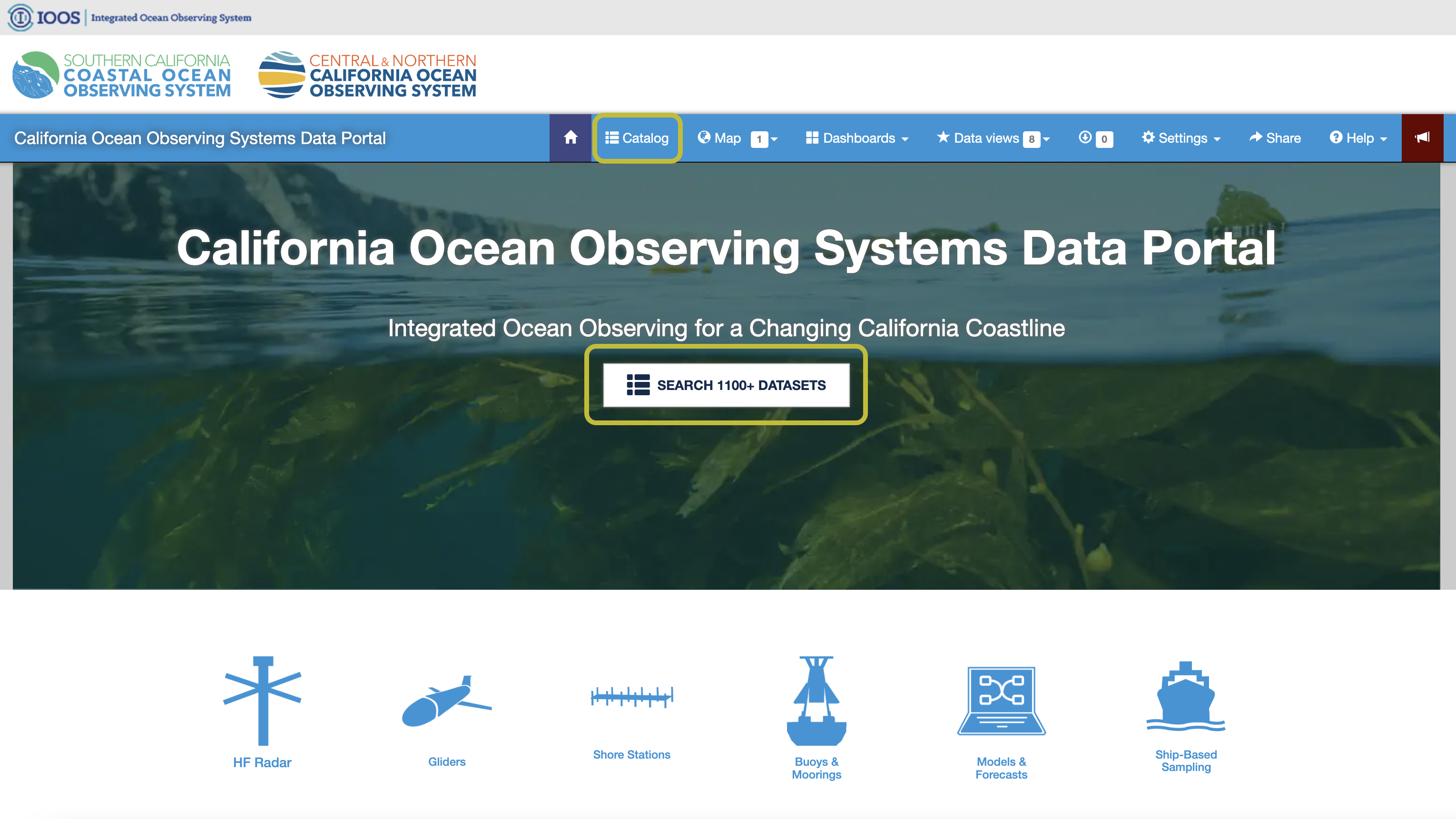
First, let's navigate to the portal home page: data.caloos.org . From this landing page, there are several ways to access different types of data. The most straightforward way to access MARINe data is by clicking on "Catalog" at the top of the page. This will take you to a page where you can search for different datasets, with some advanced searching and tagging capabilities which won't be covered in this tutorial.
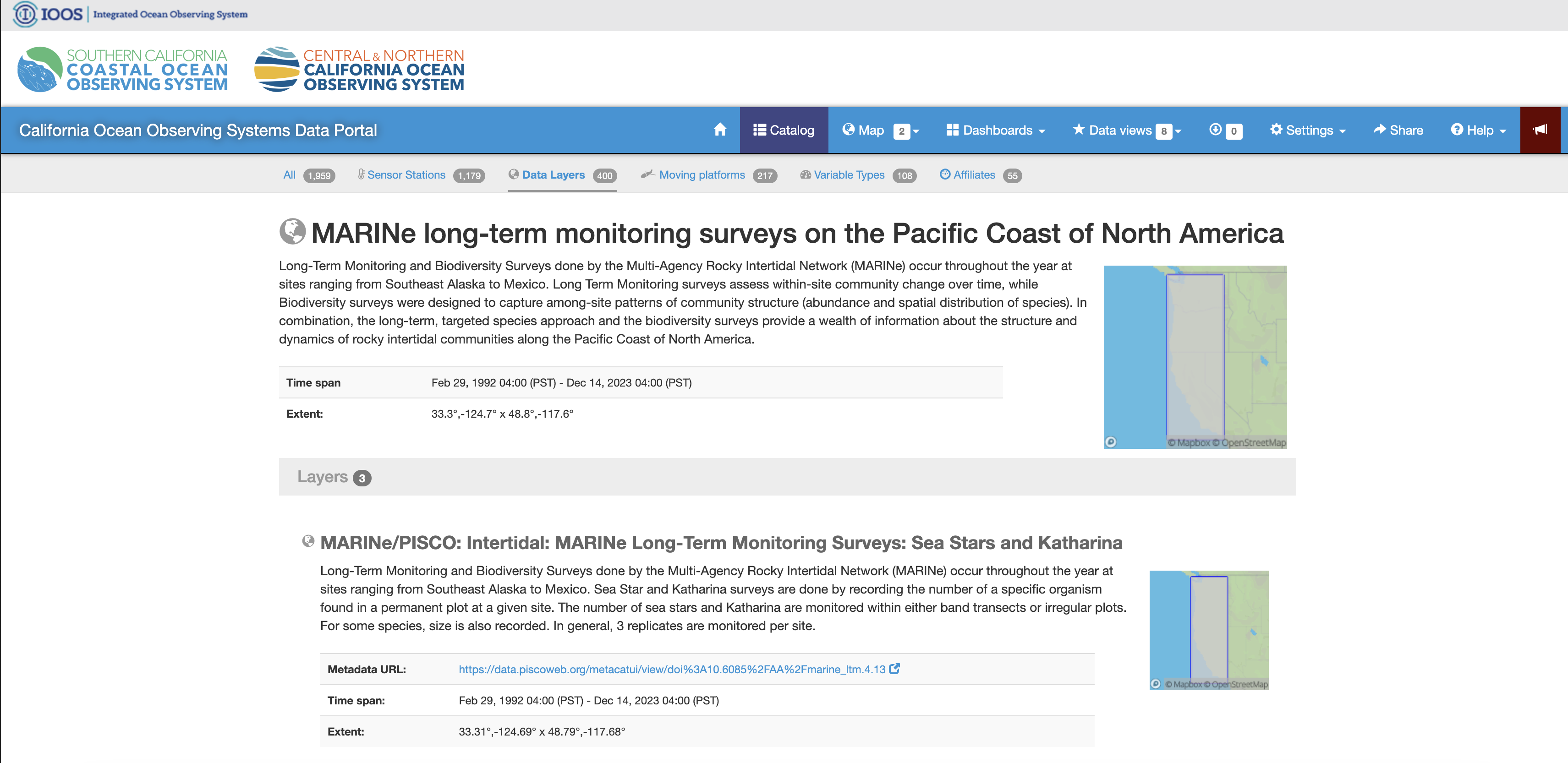
Type "marine long-term monitoring" in the search bar and press enter. You'll see there are a few datasets that appear. The MARINe Long Term Monitoring datasets are in a data layer called "MARINe long-term monitoring surveys on the Pacific Coast of North America". You'll see there are three Long Term Monitoring datasets in the CalOOS portal: (1) Sea Stars and Katharina, (2) Transect surveys, (3) Photoplot surveys.
Step 2: Visualizing the data in the Map View
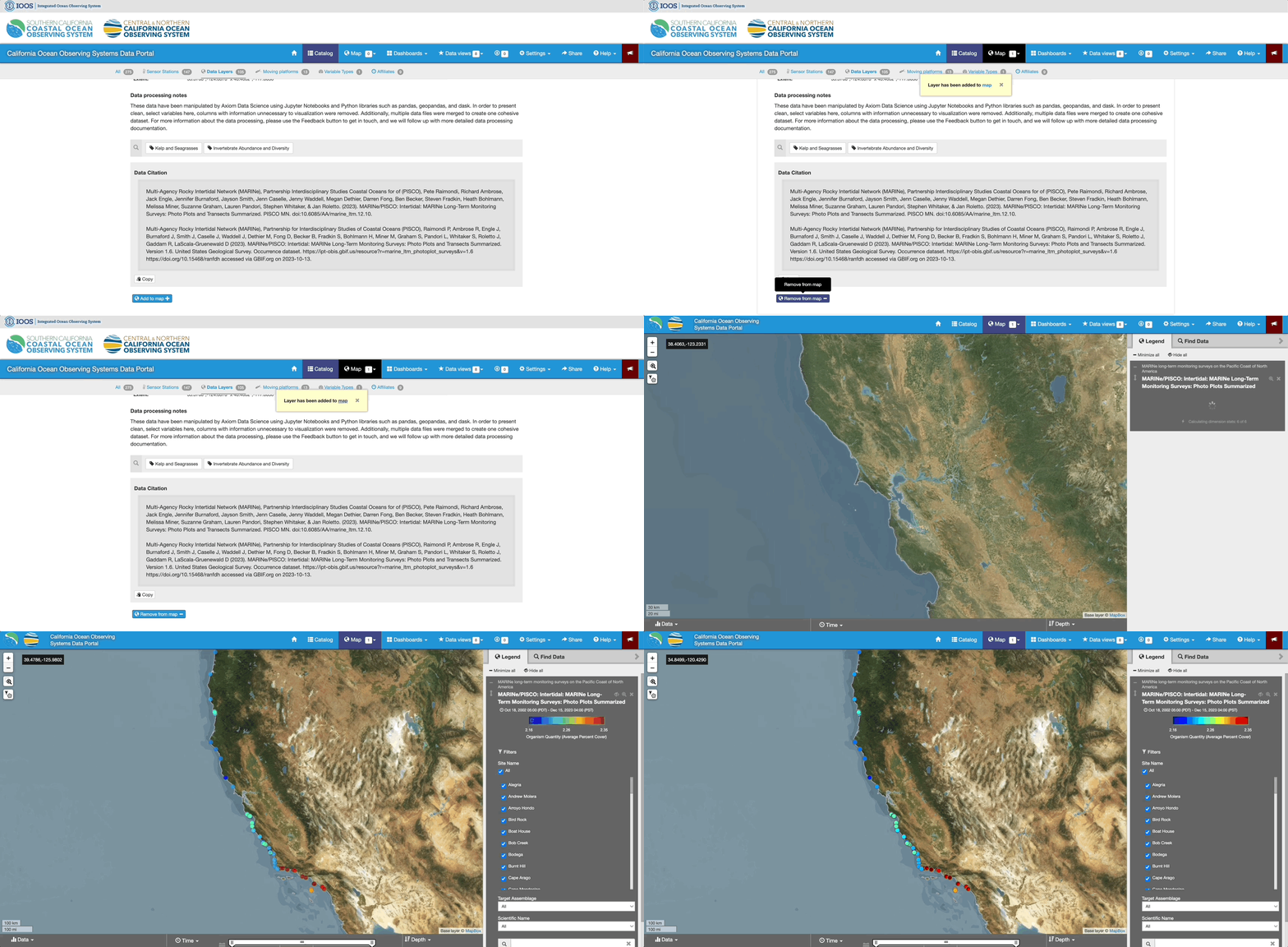
For any of the three LTM datasets, click on the blue "Add to Map" button from the catalog page. In the map view, the different colored points correspond to a measurement value. By default, in the case of the Photo Plots dataset, the different colors represent the average percent cover of all species from averaged from all time points. This isn't all that useful, so to make better use of these data, we can apply various filters which are found in the legend on the right-hand side of the map view.
We can now use the Filters located in the legend to adjust the sampling location(s) of interest, the target assemblage that was observed, and the specific organism (or "Scientific Name") to visualize.
As an example, let's say we are interested in getting information about the Hopkins Station in Monterey. We can deselect all of the stations, and then select the single Hopkins station in the "Site Name" filter. Next, we may be interest in the quantity of the mussel Mytilus californianus from Photo Plot surveys where Mytilus was the target assemblage being observed. To do this, select "Mytilus" in the Target Assemblage drop-down, and "Mytilus californianus" in the Scientific Name dropdown.
Finally, when we click on the Hopkins point on the map, a time-series figure will appear showing Mytilus californianus percent cover over time.
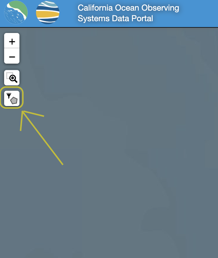
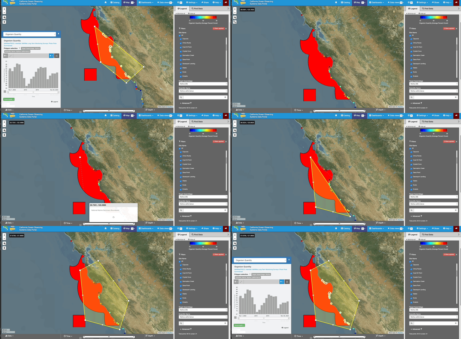
Let's say we were interested in looking at average trends in mussel intertidal coverage from of the sites within the Monterey Bay National Marine Sanctuary. We can use the Polygon Filter tool, located in the top left of the map, to select multiple stations within a polygon.
If we wanted to build a polygon around Monterey Bay while excluding certain sites, we can first deselect the sites we don't want included using the Site Name checklist in the legend, and then we can draw our polygon around our region of interest.
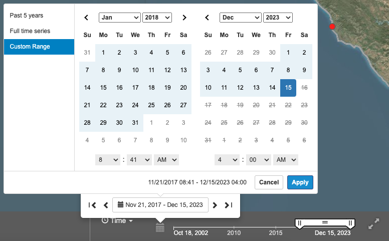
Filtering our data by temporal extent coudl also be useful. For example, we may only interested in visualizing stations where data has been collected between 2018 - 2023. To achieve this, we can use the time slider at the bottom of the Map View.
Move the slider widget to the time bounds of interest, or click on the small grey calendar icon to the left of the slider to manually input the time bounds. The map view will now only show stations that contain measurements between 2018 - 2023.
Step 3: Creating Data Views to compare multiple data streams
The "Data Views" feature allows us to bring in multiple time-series from different sources together into a single page to better understand trends in the data with context from other datasets together.
As an example, let's build a Data View to compare mussel percent cover from two different sites: Hopkins in Monterey Bay and Mussel Shoals in Southern California.
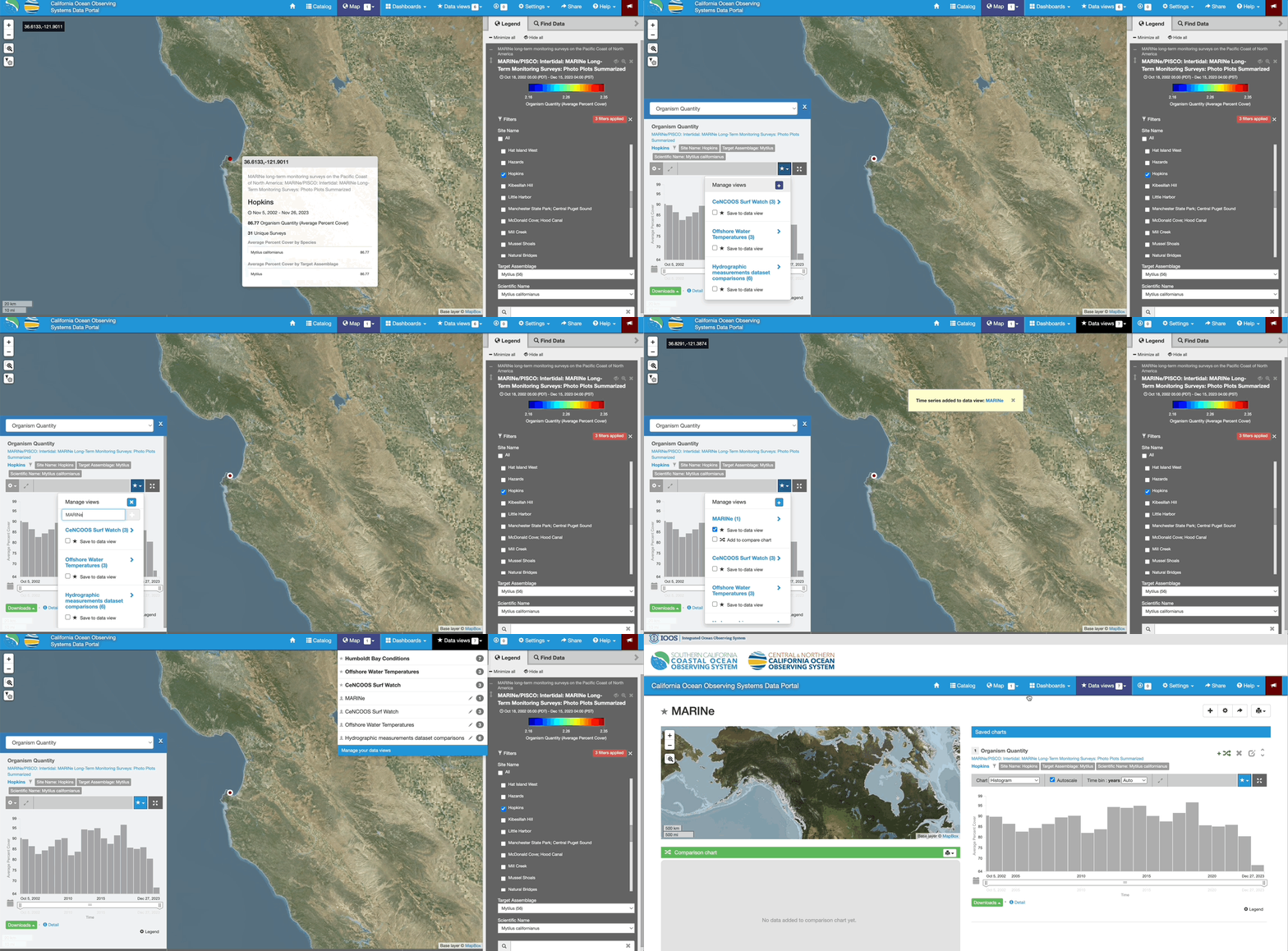
1. First, select the proper filters to plot Mytilus californianus from Mytilus target assemblage surveys using the Filters in the legend. Next, click on one of the sites of interest (e.g. Hopkins).
2. Next, click on the blue star at the top of the figure pop-up. This will bring up a drop-down where you can then click the "+" icon to add a dataset to a Data View. From there, you can create a name for your data view (e.g. "MARINe").
3. Now that you've made a data view, we have to add our dataset to it. Do this by clicking the check mark that says "Save to data view" next to the name you just inputted.
4. Click on "Data views" in the top menu bar on the top of the portal page and drop-down to the data view that you just created.
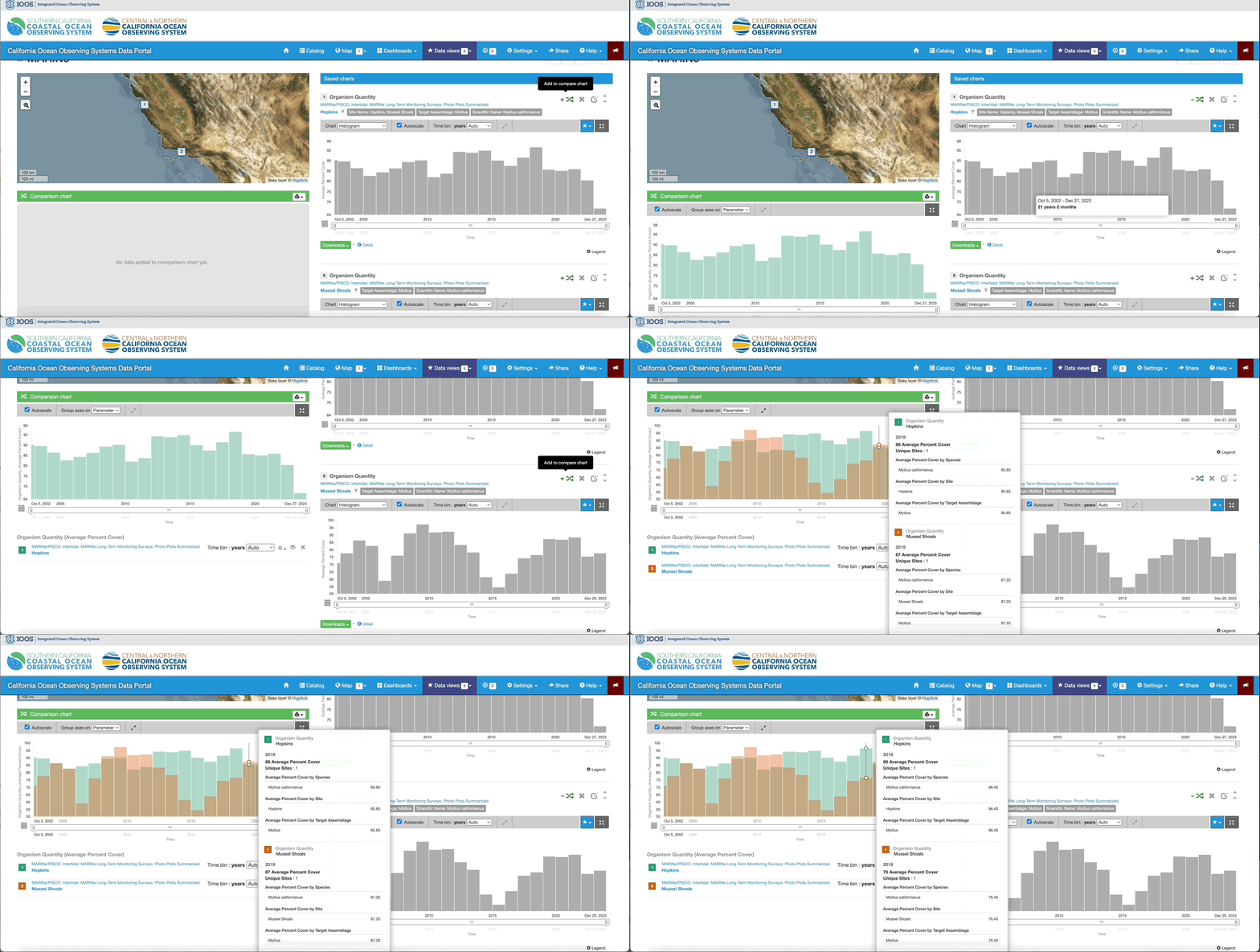
5. We can now add other stations to our data view by following the same process with a different monitoring site. One of the useful features of creating a Data View is plotting two time-series on the same chart. You can do this by clicking on the "Add to compare chart" button above each plot in the data view. This will populate the comparison chart located on the left hand side of the Data View page.
Interested in sharing your Data View? Click on the "Share" button in the top menu of your page to create a static URL for the data view to share with collaborators!
